In 2011 EDP was given a new look. A more humane, innovative and sustainable brand. With four geometric figures that can unfold into seven main shapes, EDP's image tells stories, engages people, and draws countries closer together.
Those were six intense months. Between January and July 2011, Marta Marques spent hours in meetings and working overtime in the company's former headquarters at Marquês de Pombal. Rebranding is no easy task. "It was a very challenging process, with concrete goals,"she recalls.
Marta had come to EDP Comercial in 2006. Five years later, she was invited by the Brand and Communications Director, Paulo Campos Costa, to embrace one of the projects she is most proud of. We wanted to internally standardize the company's image and have a single global brand, with only one logo,” she explains.
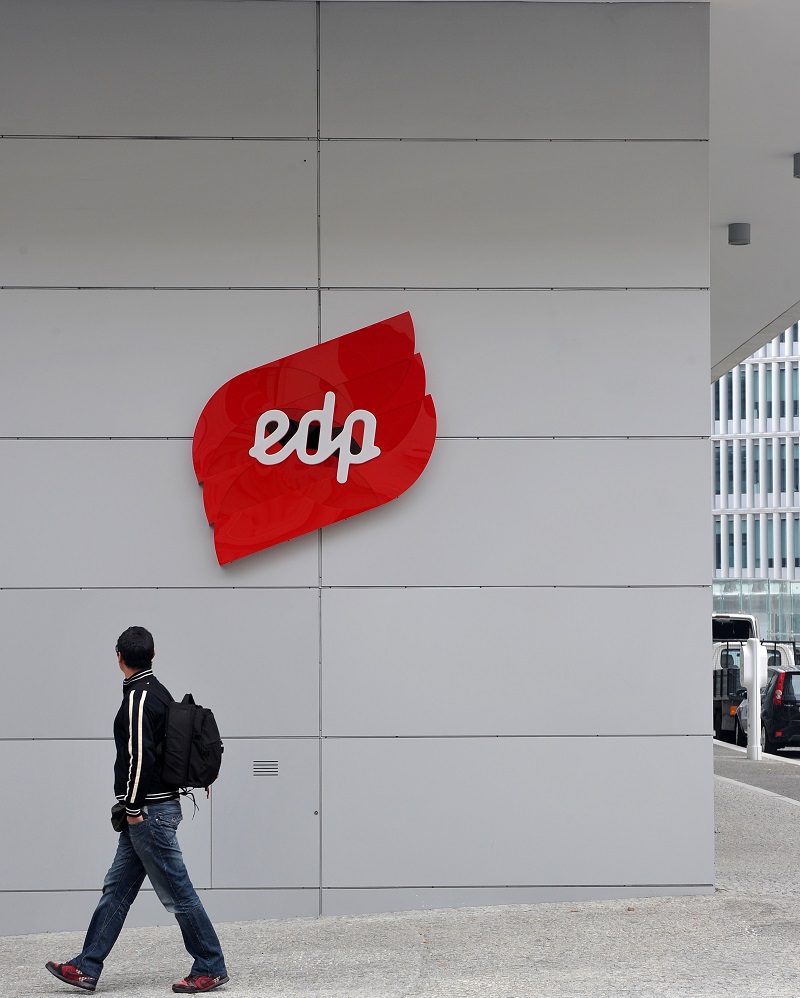
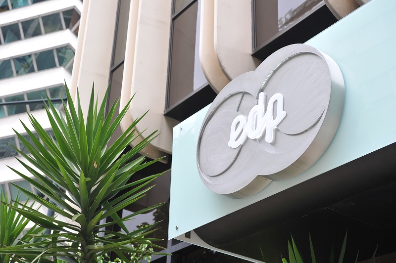
Marta coordinated the various teams in the field, in what was a large-scale logistics operation. It was necessary to change the vehicle fleet, stationaries and building facades from north to south of the country.
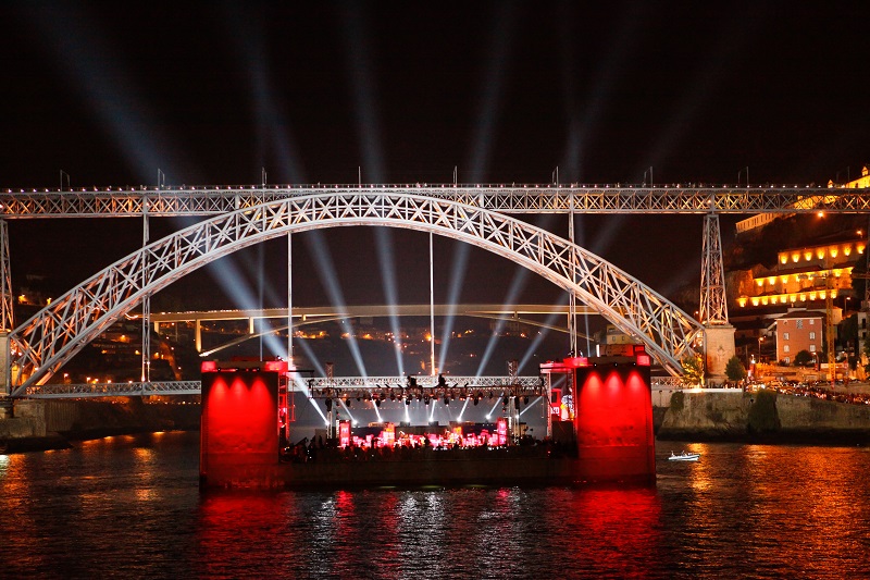
And then, on July 1st, 2011, the main buildings of the Group, in the major Portuguese cities, woke up with a new look, and the rebranding animated film was presented in Douro. "It was a memorable day," Marta Marques recalls.
Before that, EDP Brand managers traveled to New York and presented the Group's new image briefing to Stefan Sagmeister's team - a creative who is "one of the best designers of our time," Marta says. Despite the six-hour time difference, the trip from Portugal to the United States paved the way for a partnership that fully fulfilled expectations of the EDP team.
Stefan Sagmeister "was a disruptive designer, but one who would understand the past and future evolution of the brand," says Marta. On the other hand, "an outsider is entirely unaware of the company's image, is not subject to any influences and can start from scratch," says Abdul Karim, another Brand and Communication manager who, side by side with Marta, was involved in the company's rebranding. "We wanted someone who understood the brand as being independent from country, language and culture," he sums up.
On July 1st EDP's new identity become one for all the Group's companies worldwide.
it started with the spark, it went on to the turbine, it grew with the smile and now lives in an identity launched in 2011. This is the story of EDP Brand, in a video produced to celebrate EDP's 40th anniversary.
EDP had already had several looks and had changed significantly over the years. "Despite being an institution of Portuguese origin, it is a constantly growing multinational company," says Filipa Roquette, the third element of the rebranding team. Working with EDP since 2007, Filipa felt that the 'house' needed some tidying up. "In addition to being differentiated, we had to meet the goals, achieve the desired positioning, and create a unifying brand for all locations," she says.
Marta, Filipa and Abdul began by summarizing the company's values. "They began by synthesizing the brand's values in three keywords: Humane, Innovative and Sustainable. Red, a hot and warm color, remained. From Stefan Seigmeister they received seven logos which can be used interchangeably and four geometric shapes - circle, square, triangle and a semicircle - which allow for countless combinations and compositions.
These four shapes were combined and overlapped to create the 85 exclusive EDP logos. "There was a library with 100 icons which was used as a graphic linchpin for everything. It was a world of possibilities and options," says Marta Marques.
With these countless possibilities, the new identity can evolve along with the EDP brand itself. "The brand is the central object, everything else can change," Abdul explains. Just like the company. "The name EDP is always there, but evolution never stops," he adds.
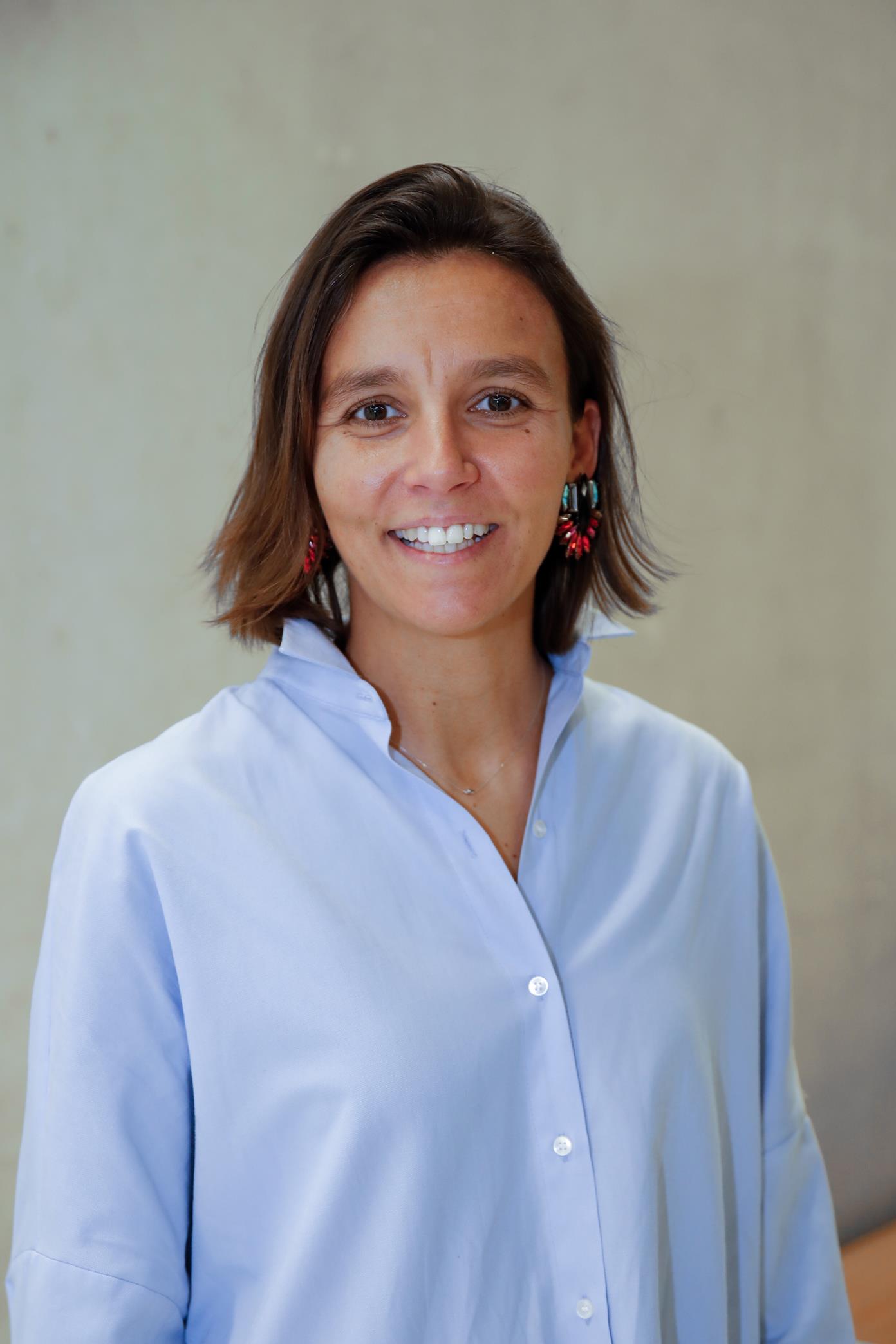
"The rebranding process paved the way for a different internal positioning. People are more focused on the customer. We no longer talk about us, now we talk directly with people."
Marta Marques
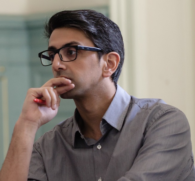
"Changing the communication and visual identity of one of the largest Portuguese companies meant rediscovering all that was being done within the company. Communicating the new brand to the outside and making it more global was an even greater challenge."
Abdul Karim
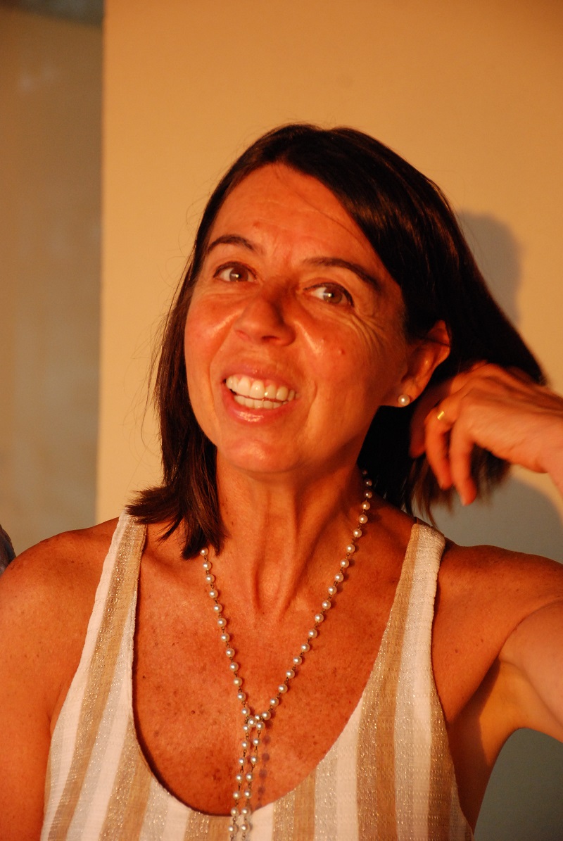
"The EDP brand underwent a huge transformation. Each company used to have its own logo. Today all are EDP, except for regulated market companies. It was a unique personal and professional experience."
Filipa Roquette
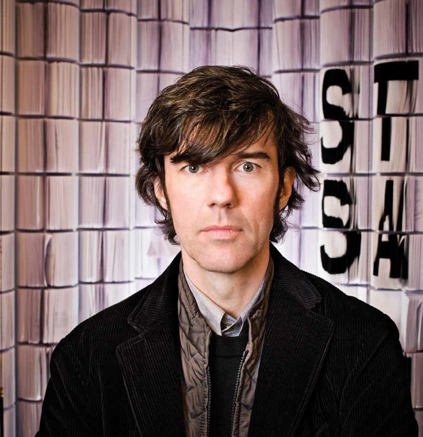
"We all worked hard to achieve this result, and all project stages required our attention, passion and energy. The goal was to visualize energy - EDP's main product - and simultaneously capture the energy of the company and its employees."
Stefan Sagmeister
In short, the logo was not the only thing that changed. EDP's Brand management now has a versatile iconographic language. The new brand is flexible, open and innovative, reflecting the Group's values. It's more than a brand. It's a new language and it reinforces EDP's positioning as a global company.

"Some companies are afraid to break with the past, to live the present as it is, to think ahead, to create and innovate. But in today's world, with constantly changing paradigms, the search for excellence and differentiation is constant. The best way to have a good idea is to have a lot of ideas. You can't be afraid of finding new ideas. You must think outside the box."
Paulo Campos Costa
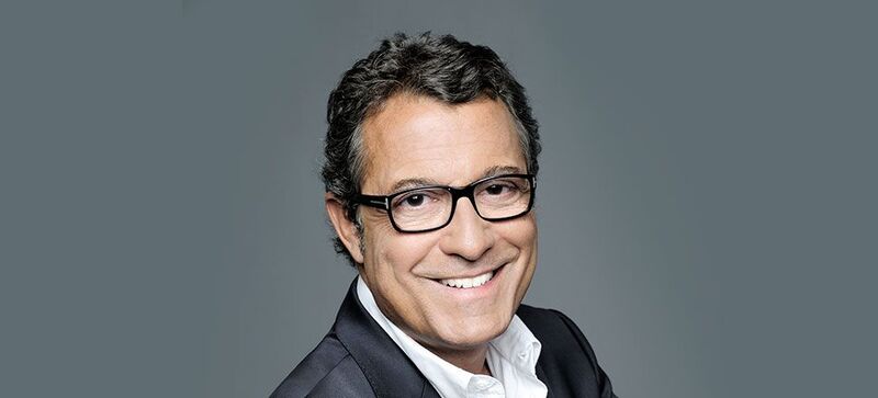
"The goal is to make EDP, currently operating in 13 countries, a global brand, with one symbol representing it across the world, strengthening its image and consistency. "
António Mexia
At a time characterized by internationalization, with EDP growing and crossing international borders, it was necessary to create a more global, international and innovative identity. Thus was born a brand that creates a global image for all countries where the company operates, a brand that follows the Group's evolution and internationalization strategy.
Therefore, in October 2011, EDP's new brand was on display at the Center for Decorative Arts of the Louvre Museum in Paris, as part of an exhibition dedicated to Stefan Sagmeister - the creator of the company's new corporate image.
